On their own, they're fine
Every item on this list exists for a reason. Somebody used it well first, and that's why it spread. On its own, each one is fine. A serif word in a headline can look great. A row of client logos helps when the logos are real. A small label above a heading is useful on a long page.
But they need to be used with thought. Not everything is needed everywhere. A label helps on a long page and is noise on a short one. A pill helps when it shows a status, and means nothing when every feature gets one.
The problem is the pile. When one screen has a pill, a numbered label, a serif italic word, a gradient, three cards and a purple glow, nobody made a choice. That's what you get when you ask for "a modern landing page" and take the first answer. People feel it, even when they can't say why.
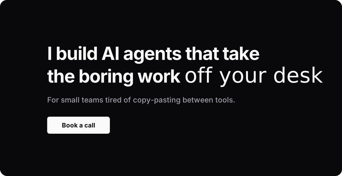
Here's the same hero twice. First with one tell:
Then with most of the list on one screen:
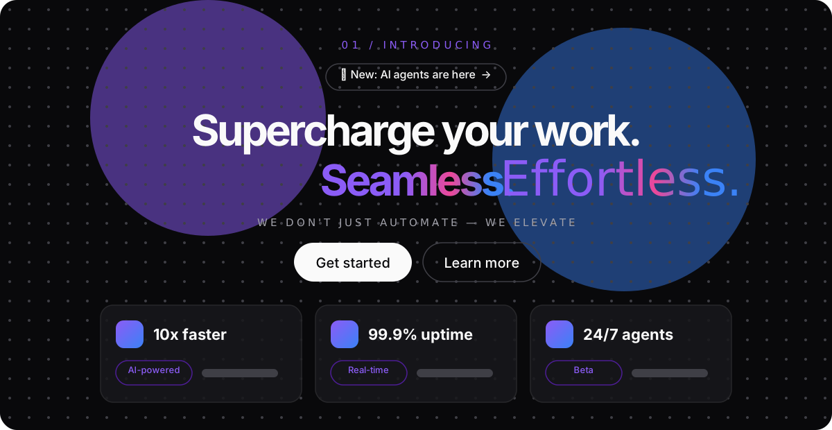
The first one has a serif italic in it, and it still looks like someone made it. The second one looks like a thousand other sites.
So read the list below as things to count. Use the ones you can explain, and keep the number low.
Type
Type is the first thing people see, so it's where the tells show up first. Most of these are small choices that every template now makes for you.
Instrument Serif
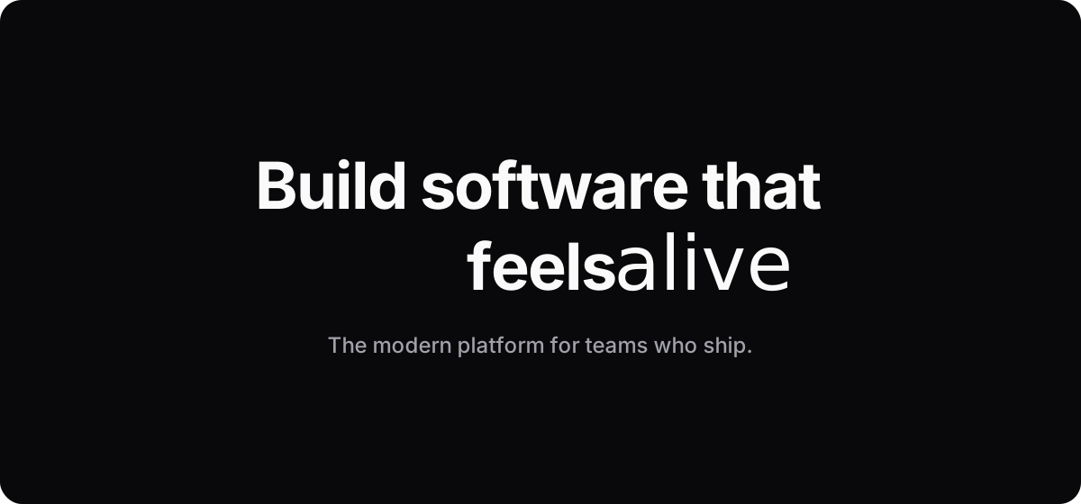
One word in Instrument Serif italic inside a bold sans headline. It looked fresh on a few sites a couple of years ago. Now every template does it.
Excessive italics
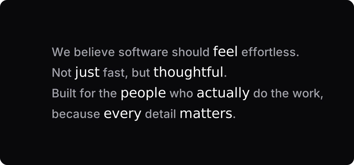
When every second word leans, none of them stand out.
Negative kerning
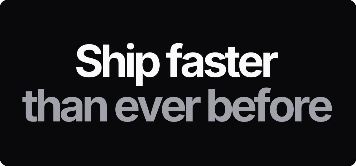
Tighter spacing looks sharp on big headlines. Pull too hard and the letters start touching.
Eyebrows
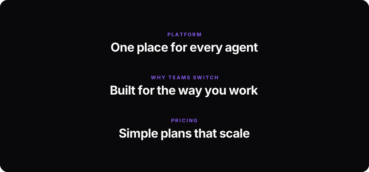
A tiny label above every heading, saying what the heading already says.
Section numbering
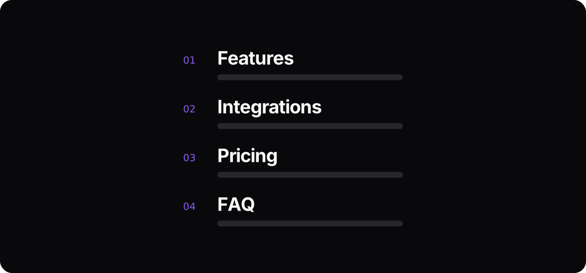
01, 02, 03 above every section, as if the page were a report. Numbers help when the order matters, like steps. Features and pricing don't have an order.
ALL CAPS subtitles
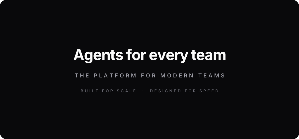
Small capitals with wide spacing. Hard to read, and on every section it starts to shout.
Excessive mono fonts
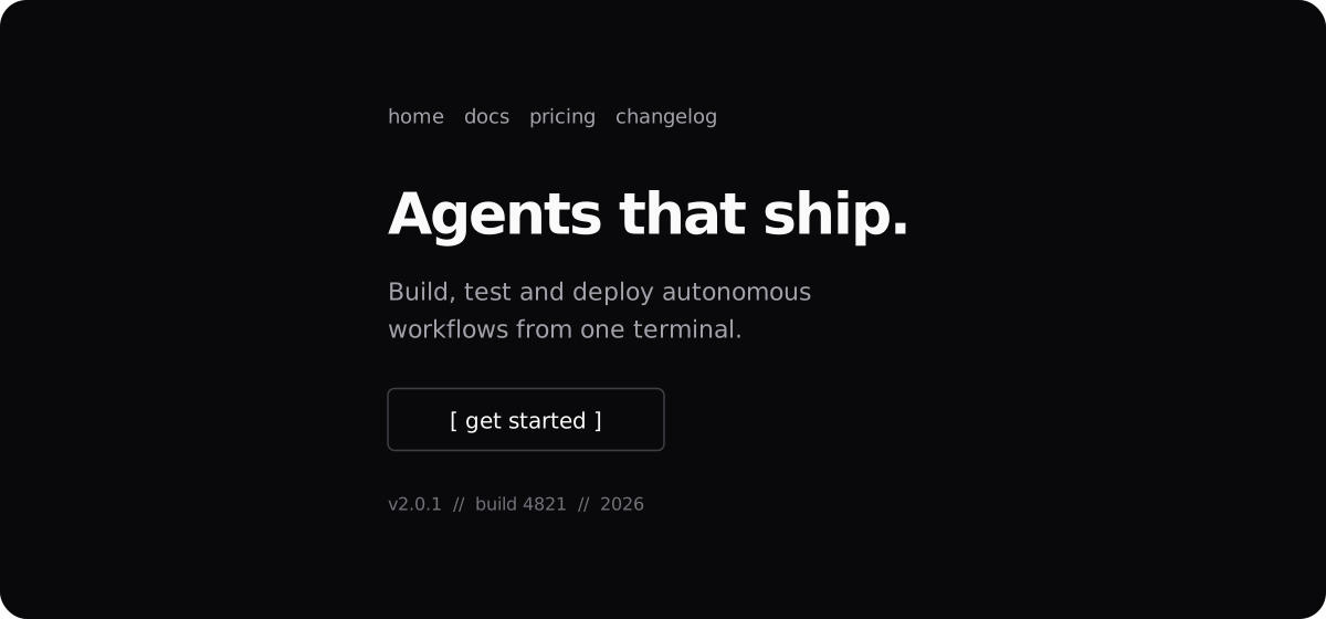
A code font for the menu, the buttons, the dates and the body text. A bit of mono says technical. All of it says template.
Periods in titles

Fast. Secure. Built for teams. Short headlines with full stops read like a slogan generator.
Gradient text
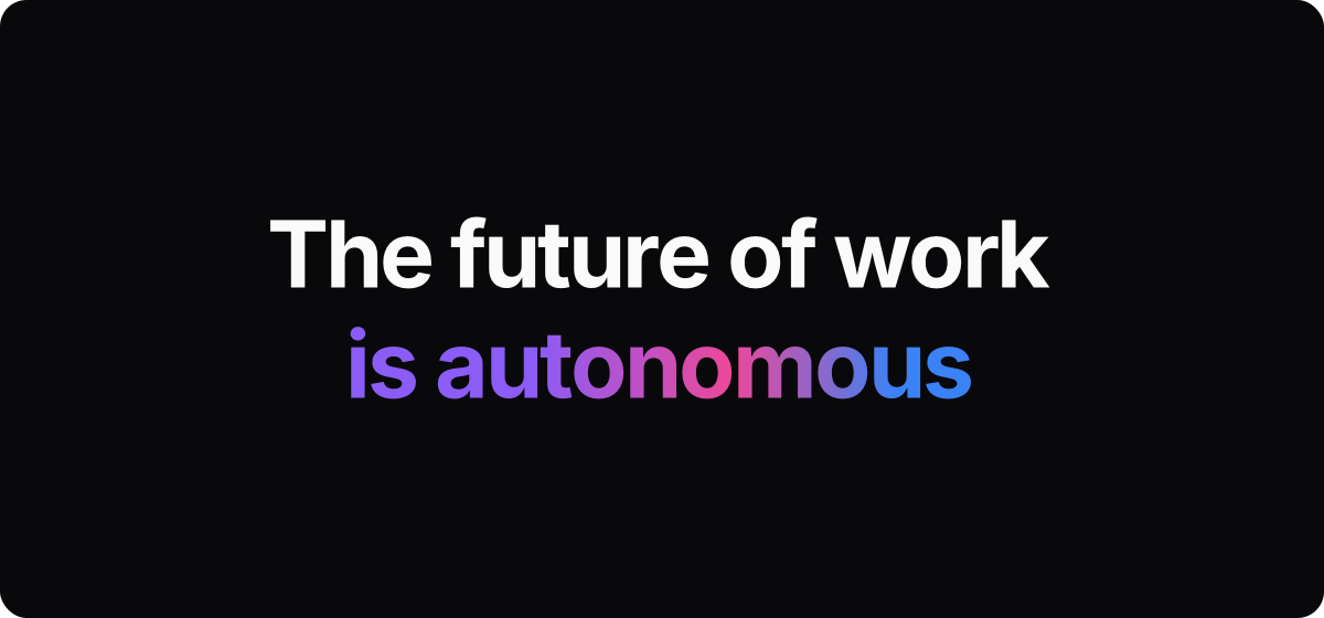
Purple to pink to blue across the words that matter most.
Layout
These are the page shapes. You've scrolled past each of them so often that your eye skips them before you read a word.
Over-the-top detailed UI
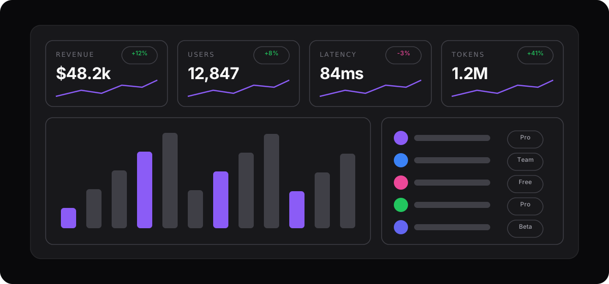
A product mock-up with sparklines, badges, avatars and percentages in every corner. Real dashboards are rarely this busy.
Containers with borders
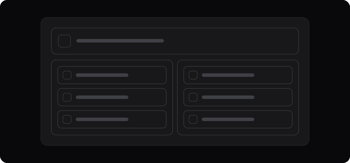
Boxes inside boxes inside boxes. When everything is in a box, nothing is grouped.
Overusing dividers
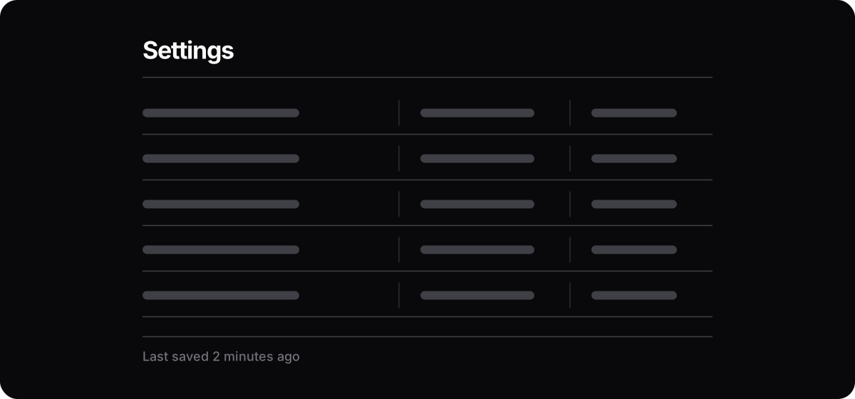
A line between every row, every column and every heading. Space does the same job, quieter.
The hero formula
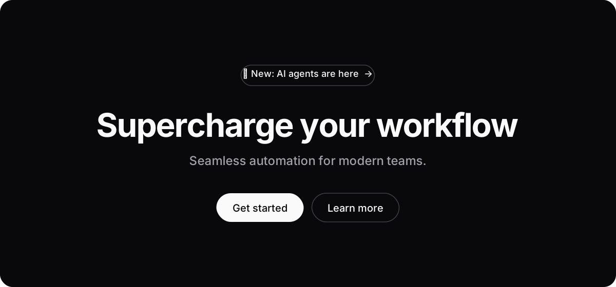
A pill badge, a headline with a verb like "supercharge", one grey line, a white button and an outline button. You've seen this page a thousand times.
Three feature cards
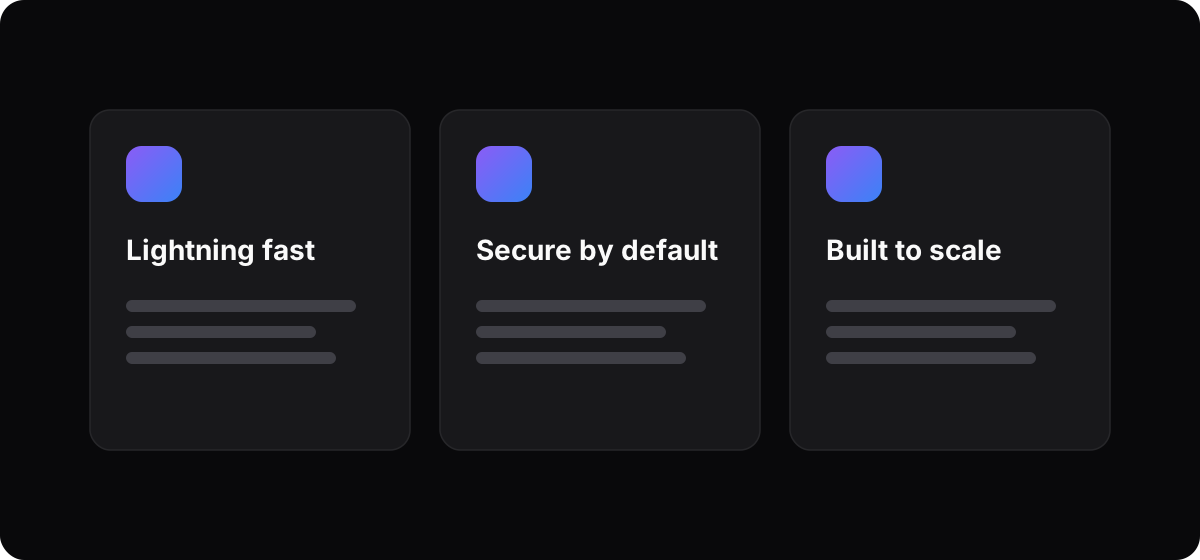
Icon, bold title, two lines of grey text, three times in a row. The most generated layout there is.
Bento grids
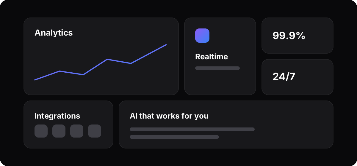
Boxes of every size, each with a tiny chart or a number. Looks busy, says little.
Stat strips
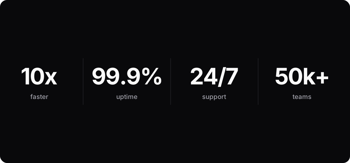
10x, 99.9%, 24/7. A number without a source is decoration.
Logo rows
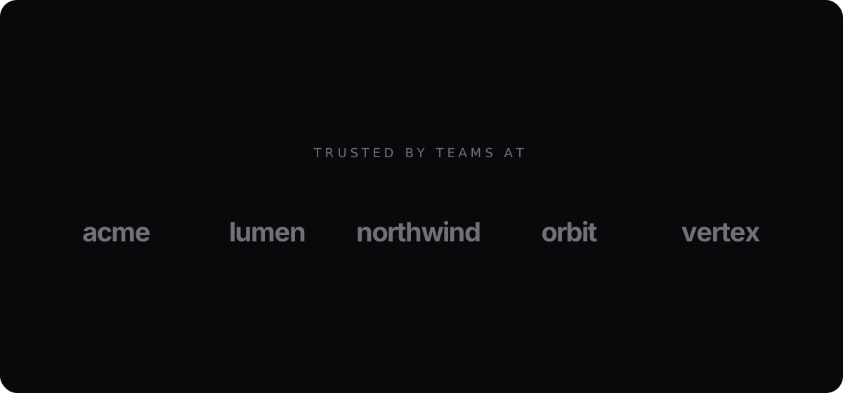
"Trusted by teams at" and five grey wordmarks. It works when the logos are real and known. Most aren't.
Decoration
This is the stuff added to make a page feel finished. It fills space, but it says nothing about what you do.
Tags & pills
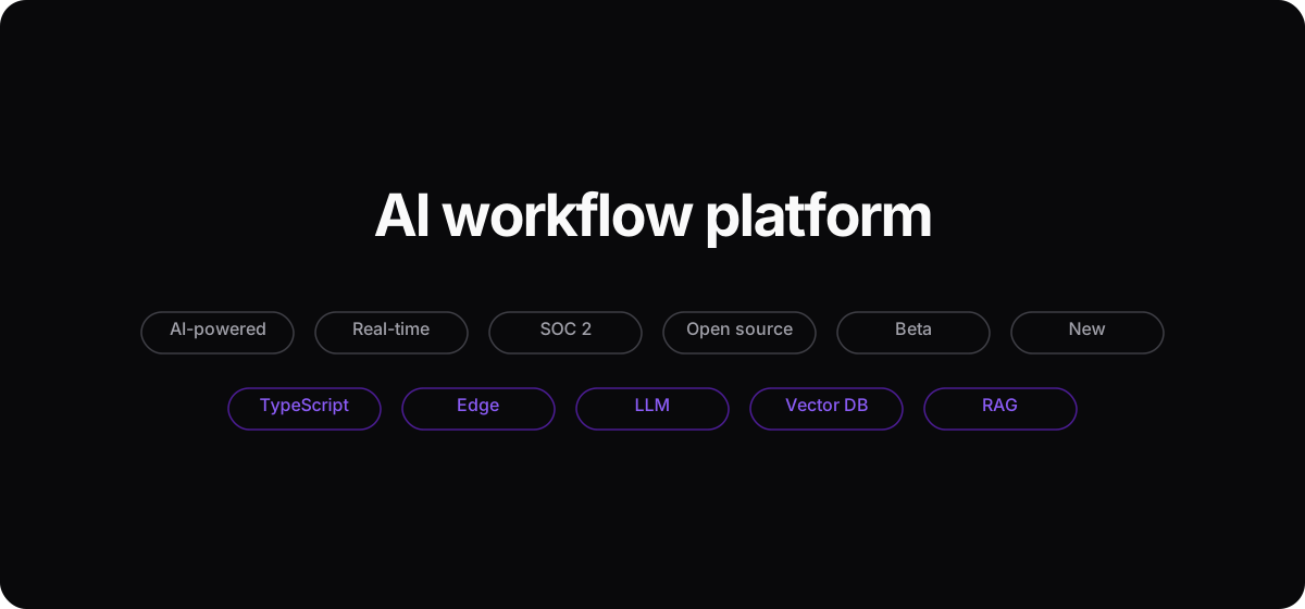
Pills are for status. When every feature gets one, they stop meaning anything.
Gradient backgrounds
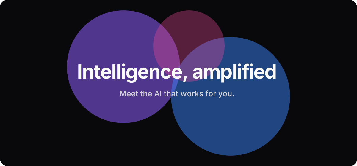
Blurred purple and blue blobs behind the hero. The default colour of AI.
Color shades & opacities
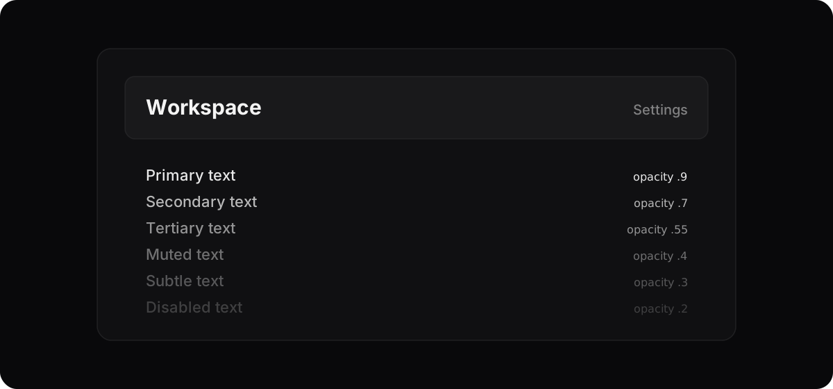
Text at 90, 70, 55, 40, 30 and 20 percent. Pick three.
Dithering

Images and gradients made of dots, like an old printer. A nice effect once, a preset now.
ASCII images
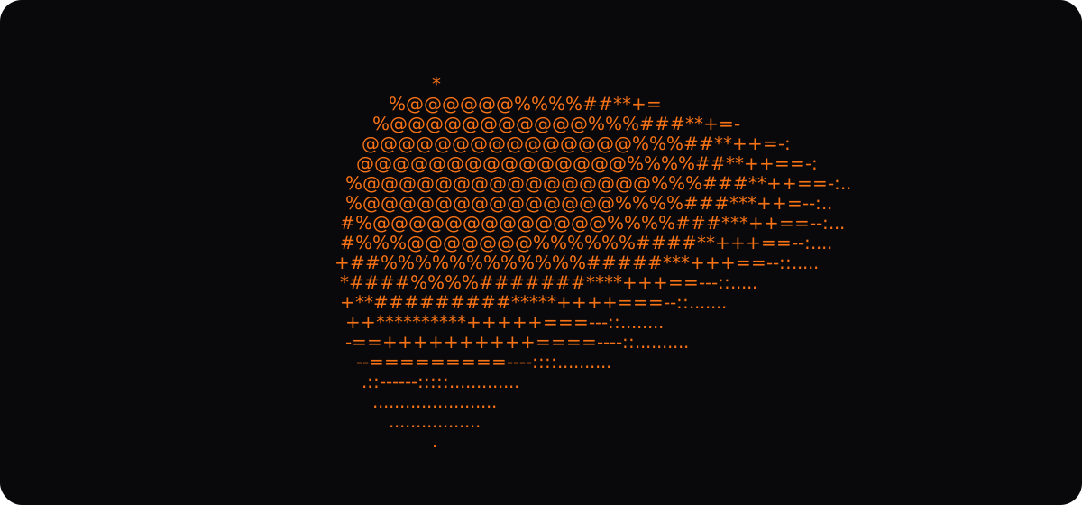
Pictures drawn in characters. My site uses ASCII, so this one's on me ;)
Squircles
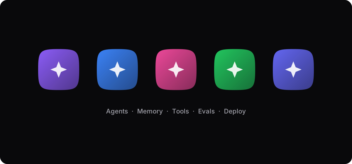
App-icon shaped tiles with a gradient and a symbol, one per feature.
Code breadcrumbs
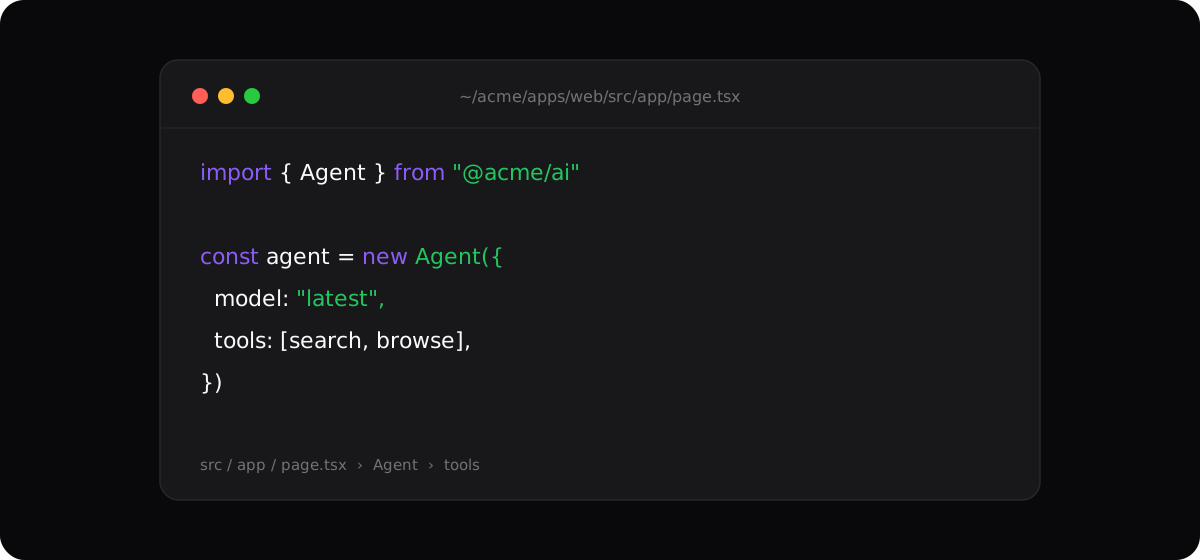
A file path above the code, a trail of folders under it, and three traffic-light dots on a block that isn't in a window.
Overly detailed diagrams
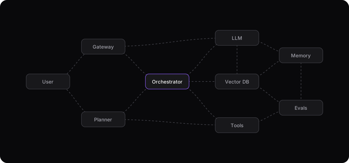
Nine boxes, fifteen dashed arrows. If you need a minute to read the diagram, it's not helping.
Frosted glass
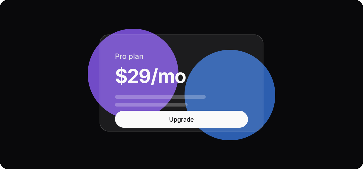
See-through cards with a blur behind them.
Dot grid backgrounds

A grid of dots fading out from the middle, so the page doesn't look empty.
Sparkles, live dots and ⌘K
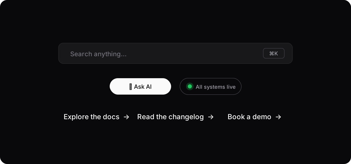
Small signals that each mean something, used everywhere until they mean nothing.
Motion
Movement grabs attention once. After that it's something you wait for.
Count-ups and typewriters
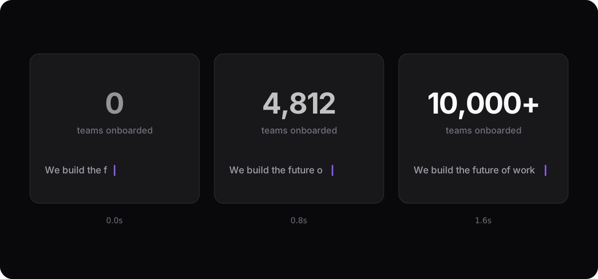
Numbers that count up from zero, text that types itself out, every block fading in as you scroll. Once, it's a moment. On every section, it's waiting.
Copy
The words give it away even faster than the design.
Verbose, redundant text
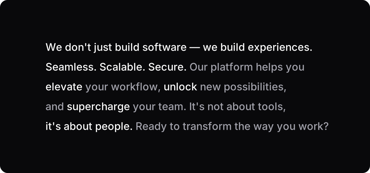
Long sentences that say little, plus the usual giveaways: "we don't just build X, we build Y", long dashes, everything in threes, and seamless, elevate, unlock. People spot these before they notice any of the design.
What I cut from my own site
This is the part of my homepage where you can hire me. Before:
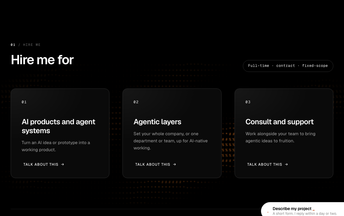
A numbered label above the heading, a pill next to it, three bordered cards with their own numbers, and all-caps links with arrows. Five tells in one section.
After:
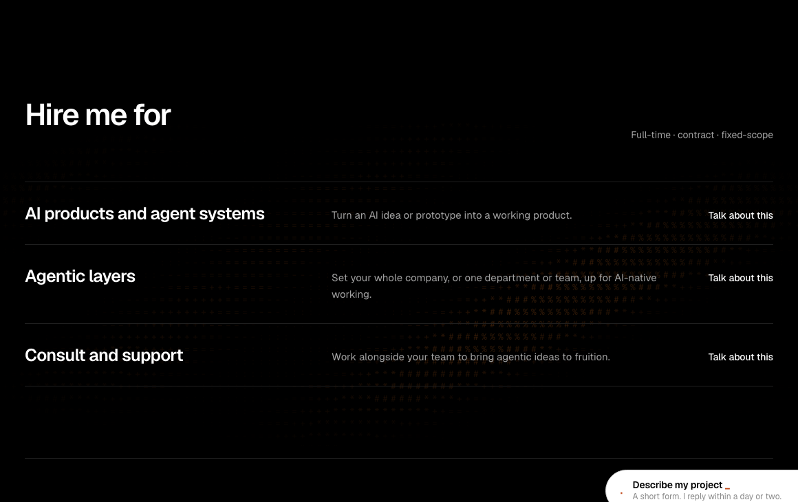
Across the whole site I cut:
- The numbered labels above every section
- The periods at the end of headings
- Most of the code font and all-caps, which is now only on numbers and dates
- The arrows on links
- The tags under each case
- The pills, including the dot on the MCP button
- The three cards in "Hire me for", which are now a stacked list
I kept the orange ASCII, because that's the one thing that's mine, plus the client logos, the real numbers and the FAQ.
How to keep the ones you like
Pick one thing that's yours and let it carry the page. For every other tell on this list, ask why it's there. If you can't answer, cut it.
Then count. One or two on a page is a choice. Five on one screen is a template.