Where this comes from
In February 2026 Alex Hormozi posted an 86-second short called We Make Our Landing Pages Like This. It's a fast list of how his companies build the page behind an ad. This post is that list, written out, with an example of each part.
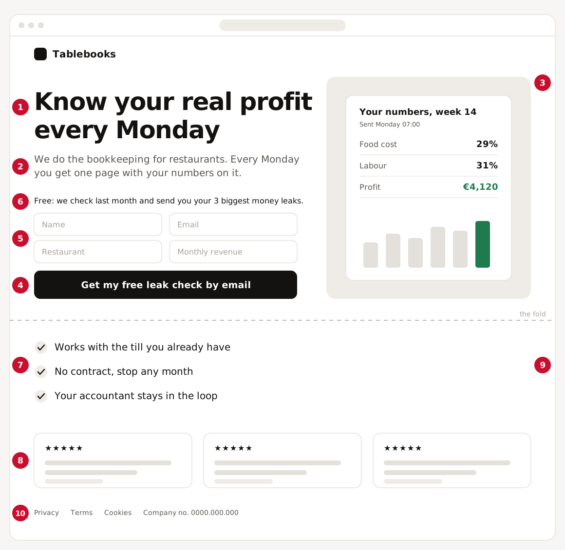
All the examples use one made-up page: a bookkeeping service for restaurants called Tablebooks. Here's the whole page, with the ten parts numbered.
Above the fold
This is what people see before they scroll.
1. Headline
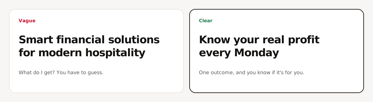
The headline has two jobs. Stop the person, and promise a clear outcome. If someone can't tell what they get from the headline alone, it isn't doing its job.
2. Subheadline
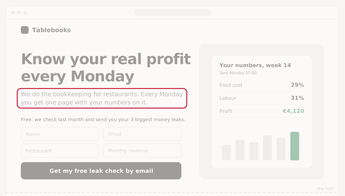
The subheadline makes the promise clearer. Hormozi compares the pair to a YouTube video: the headline and the subheadline work together the way a title and a thumbnail do. Each one adds something the other one doesn't say.
3. Hero image
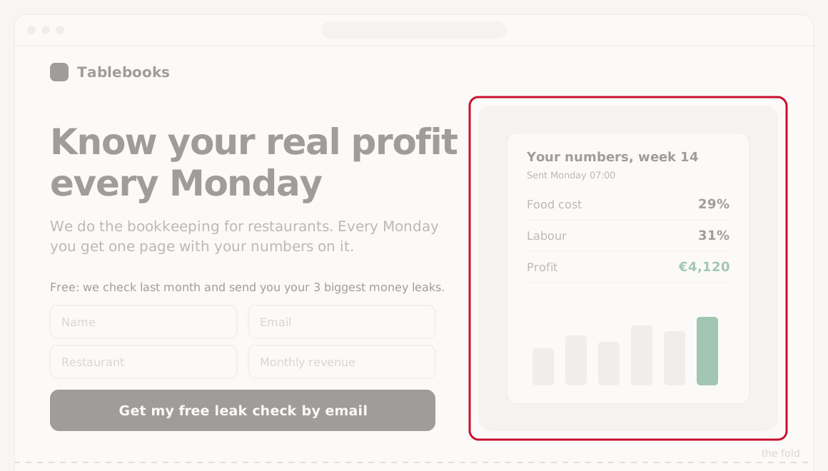
The image backs up the headline and subheadline. Either show the thing they're going to get, or show the outcome they want. Here that's the actual Monday report, with the profit number on it.
4. Button
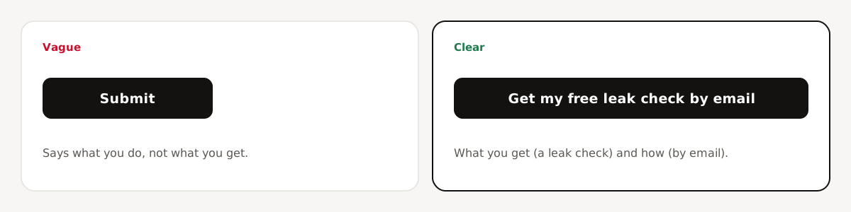
The button says what they're going to get and how they're going to get it. Nothing else. "Submit" says what you want them to do. "Get my free leak check by email" says what they get (a leak check) and how (by email).
5. Form
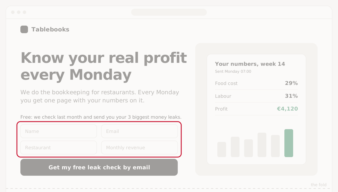
Ask for as little as you need to get a qualified lead. That can still be four or five fields. Hormozi says he asks for more now than he used to. Early on he wanted more opt-ins. Now he wants more customers.
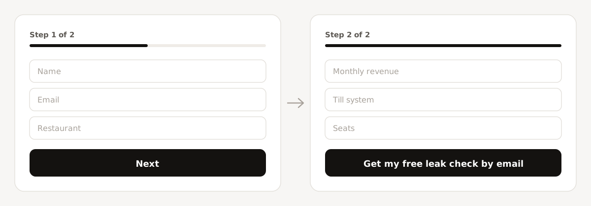
If you need more than five fields, split the form into steps.
6. One-liner (optional)
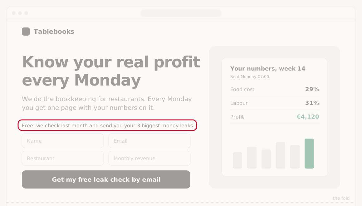
If you're giving something away, like a free check or a guide, add one line that describes it. Its only job is to answer: why should I give you my email?
Below the fold
Not everyone scrolls this far. This part is for the people who are interested but not sure yet.
7. Three bullets
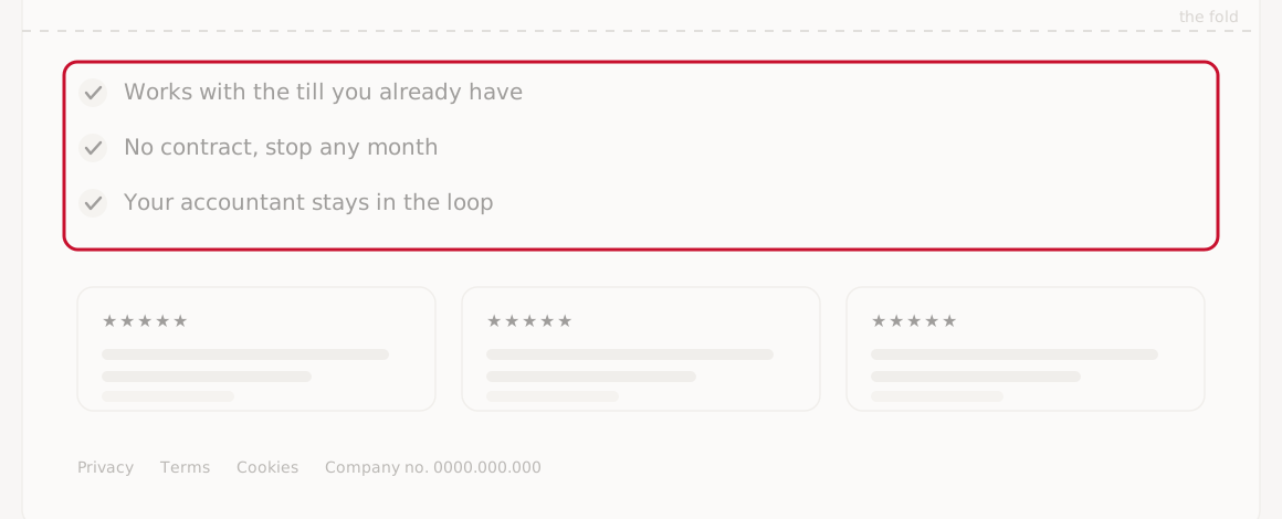
If you put bullets under the fold, he likes three. Each one answers one of the three biggest objections, starting with the most common. For the restaurant page that's: will it work with my till, am I locked in, and what about my accountant?
8. Social proof
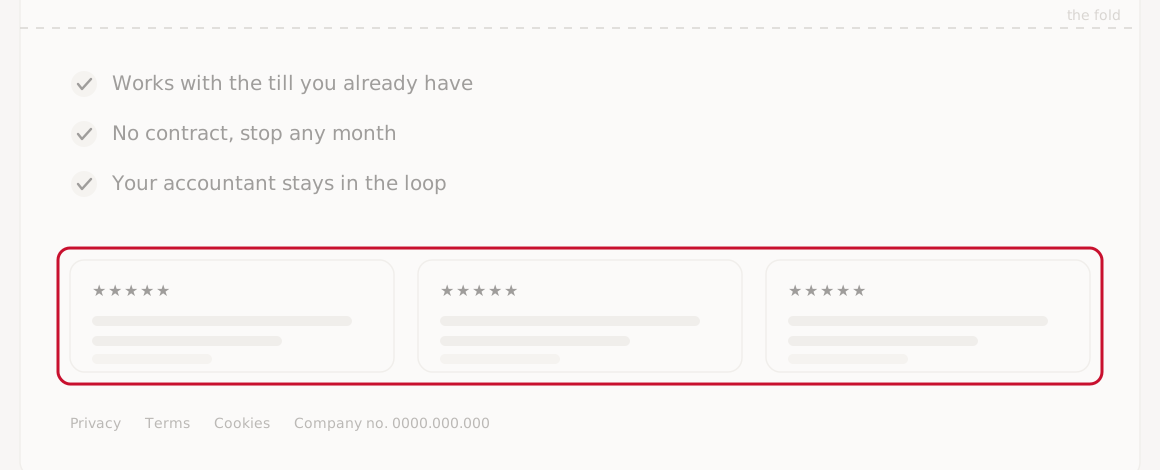
He used to put a lot of social proof on his landing pages. Now he only adds it when he needs it, or when the offer is more complex. When he does, it goes below the fold.
9. Keep everything else blank
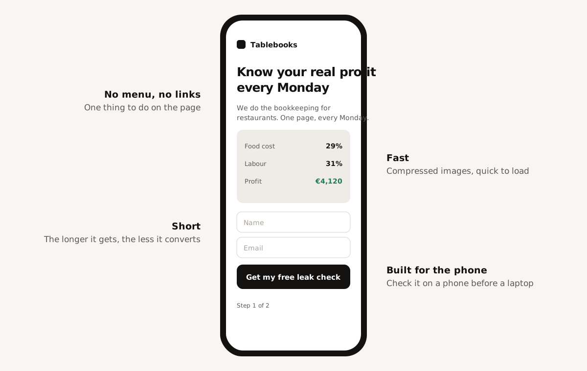
Everything else on the page should be empty, so all the attention goes to the one thing you want them to do. No menu, no extra links.
The longer the page gets, the lower it usually converts. So keep it short, build it for the phone, keep it fast, and compress the images so it loads quickly.
10. Legal
Last, add the legal stuff, like privacy, terms and cookies, so you don't get in trouble.
The one rule
Every part above comes down to the same test. In his words: "if it doesn't increase optin percentage of qualified leads, cut."
That's why the list is so short. Before you add a section, a link, a logo row or another testimonial, ask whether more of the right people will fill in the form because of it. If the answer is no, leave it out.